Writing a Document: Design aids
Once you have all your information together, and the body of your text is at least hashed out somewhat, you can start to consider how you want your document to look. One of the biggest features of the document needs to be how you present it to your audience. This is a very important thing to consider, as most people are not going to pick up your document, and read it from front to back, especially if it is too long, or too wordy. The double edged sword on this is, most engineering documents have to be long and wordy, inasmuch as they need to be descriptive. Consider the following ides, put forward by "Technical Communication Today".
Use Headers on major talking points
For some people, this comes naturally, for others, not so much. But using headers will help keep your readers on track, as to what you are trying to tell them. Additionally, if someone is skimming for information that is only important or applicable to them, it will help that person find what they are looking for faster.
Sum up information with side tables and bullet points
Using bullet points is a very effective way, to lay out key points, in regards to a topic:
Use color if possible
Using color in your document is a great way to pull the readers eyes to key elements. If you have a side bar of information, highlight it in color. If you need drive a point home, as in, this can NOT be missed, color is a good way to bring that point home. All this being said about color, do not go crazy with it. Consider the fable of the Boy Who Cried Wolf. If every minor point is in color, people are not going to pay attention to the very important things.
Charts, Graphs, and Pictures
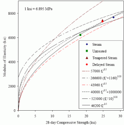
Nothing will break up your reports more, and make it easier to understand, than with charts and graphs. This is because more people learn visually than through reading. If you can graph out a point you are trying to make, like the strength of a component being too weak for the load it will have to handle, a graph will drive that point home. Trying to explain a picture? Well, the picture itself is worth a thousand words. Some people will try to avoid pictures, figures, charts, and graphs, as they can be a bit distracting. But to get your point across, and make your reader better understand the content of the report, a picture to break up the text is a great idea (Johnson-Sheehan 2009).
Use Headers on major talking points
For some people, this comes naturally, for others, not so much. But using headers will help keep your readers on track, as to what you are trying to tell them. Additionally, if someone is skimming for information that is only important or applicable to them, it will help that person find what they are looking for faster.
Sum up information with side tables and bullet points
Using bullet points is a very effective way, to lay out key points, in regards to a topic:
- Bullets help information to jump off the page.
- Information can be summed up in a few words.
- Bullets give quick lists, highlighting claims made in the body of the text.
Use color if possible
Using color in your document is a great way to pull the readers eyes to key elements. If you have a side bar of information, highlight it in color. If you need drive a point home, as in, this can NOT be missed, color is a good way to bring that point home. All this being said about color, do not go crazy with it. Consider the fable of the Boy Who Cried Wolf. If every minor point is in color, people are not going to pay attention to the very important things.
Charts, Graphs, and Pictures
Nothing will break up your reports more, and make it easier to understand, than with charts and graphs. This is because more people learn visually than through reading. If you can graph out a point you are trying to make, like the strength of a component being too weak for the load it will have to handle, a graph will drive that point home. Trying to explain a picture? Well, the picture itself is worth a thousand words. Some people will try to avoid pictures, figures, charts, and graphs, as they can be a bit distracting. But to get your point across, and make your reader better understand the content of the report, a picture to break up the text is a great idea (Johnson-Sheehan 2009).